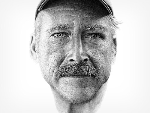
Concentration #2 inspiration: Miguel Endara
What makes Miguel Endara's work so realistic is his use of value and line weight. To show highlights, he keeps areas completely blank, and the contrast he makes with the completely dark areas creates depth and realism. He uses line weight to show thickness of certain areas in the eyebrows and hair, giving them more weight. |
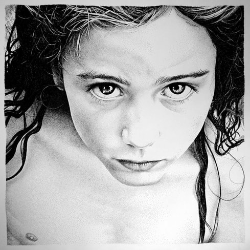
Concentration #1 inspiration: Pablo Juardo Ruiz
For my concentrations, I'm working with pen and ink, specifically stippling. Pablo Juardo Ruiz is a Spanish artist whose art largely consists of stipple drawings. I like how Ruiz still manages to show highlight and shadow without compromising the realism of the subject's features. He does an excellent job utilizing the space between the dots to show highlights and shadows, and it adds character to his portraits and creates a particular mood. His portraits are not only realistic, but expressive. Not all of his portraits are expressive through large, strong facial expressions, but rather many of them are through subtle details that still eloquently tell a story. |
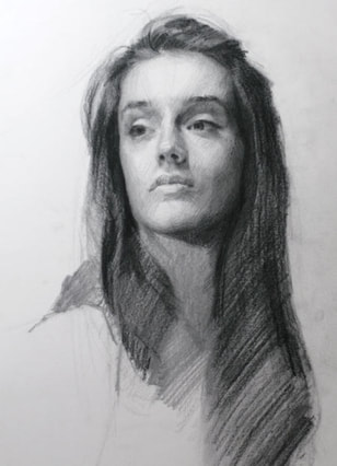
Charcoal inspiration: Louis Smith
I think Louis Smith's charcoal drawings are very neat, particularly the portraits. I like how he uses detail to emphasize the "most important parts," such as the face. He makes the facial features very detailed, but he keeps the hair and bust rather undeveloped so as not to draw too much attention to them. I also like his use of value with showing the light sources. He does a good job of including shadows in all the right places, and it adds a lot of depth and character to his portraits. |
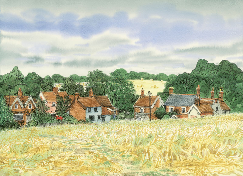
Pen and ink inspiration: David Gentleman
I love David Gentleman's style of art. I love how he uses washes to add color, but then adds in details with pen. He has a rather sketchy style that I like, but it also feels realistic with all the details he includes. |
